 Image 1 of 1
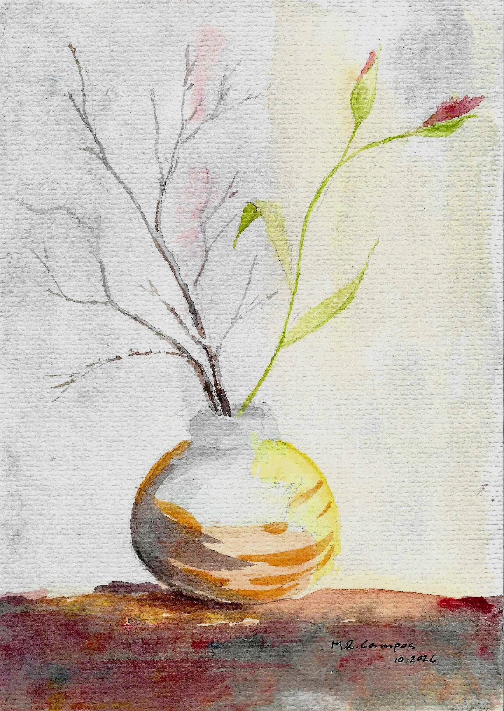
I enjoyed the contrast of the stiffness of the branch and the softness of the blossoms. So I decided to practice drawing a vase and added the contrasting objects as company.
Curator’s comments: Why the Composition Actually Works
If you look closely at how the entire page is designed, the artist has carefully created counter-weights so the painting doesn't actually fall over visually:
The Yellow Highlight Counterweight: Look at the round vase. The bright, warm yellow highlight is pushed heavily to the right side. This vibrant patch of color creates a strong "visual weight" that pulls your eye over and balances out the dense cluster of dark branches on the left.
The Crimson Base: The dark, rich crimson and earthy wash at the very bottom right acts like a heavy anchor, grounding the delicate green stem floating above it.
Negative Space: The vast, quiet background on the upper right gives the single stem room to breathe. It turns the simplicity of that side into a feature, not a mistake.
It feels like a beautiful representation of a seasonal transition—winter on the left, spring/life on the right—held together by a very clever use of color placement on the vase. It has a wonderfully serene, deliberate mood to it.
I enjoyed the contrast of the stiffness of the branch and the softness of the blossoms. So I decided to practice drawing a vase and added the contrasting objects as company.
Curator’s comments: Why the Composition Actually Works
If you look closely at how the entire page is designed, the artist has carefully created counter-weights so the painting doesn't actually fall over visually:
The Yellow Highlight Counterweight: Look at the round vase. The bright, warm yellow highlight is pushed heavily to the right side. This vibrant patch of color creates a strong "visual weight" that pulls your eye over and balances out the dense cluster of dark branches on the left.
The Crimson Base: The dark, rich crimson and earthy wash at the very bottom right acts like a heavy anchor, grounding the delicate green stem floating above it.
Negative Space: The vast, quiet background on the upper right gives the single stem room to breathe. It turns the simplicity of that side into a feature, not a mistake.
It feels like a beautiful representation of a seasonal transition—winter on the left, spring/life on the right—held together by a very clever use of color placement on the vase. It has a wonderfully serene, deliberate mood to it.